Sunday, December 9, 2012

Trip to Japan- A lesson on photography

I had the opportunity to go to Japan for 12 days in November. :) I posted most of the better photos on Facebook already but since this is an art blog, I'm going to comment on some of my favorite photos in terms of design and things to be aware of when taking a photo.

One of the biggest things I try to keep in mind is that a photograph is two-dimensional, which changes the angle and position of the picture. 


Water- Water is so interesting! Part of the reason I took this photo was because I loved the reflection of the trees in the water. In a photograph, the reflective nature of water can affect the way a photograph turns out. So next time you take a photo or are looking for a photo opp, look out for reflections!


Orientation- Vertical or Horizontal? Keep in mind there are two ways you can take the pictures (well more if you count diagonals but we'll stick with the traditional :) ). Depending on which orientation you choose you can get a different feeling for both. When I'm not sure which one to use when I take the photo, I quickly snap both so I can choose later. I can get a better feel for a photograph on the screen of my computer. Which do you like better? The horizontal captures the large amount of foliage and the red leaves draw the eyes more because it is contrasted with the green leaves. The vertical one highlights the height of the tree. There is a certain delicacy because of the open space of the sky and details created by the lines of the dark branches at the top of the tree. There are many things that draw our attention and so the red leaves are not as dominant. What do you think? 


Lines- When I took these photos I had to change my perspective to a 2-D perspective. I looked at the wooden poles in the left photo, not as poles, but as lines. Lines always lead the eye so I thought it would be interesting to frame the scene so that our eyes are drawn up towards the center of the tree and also down towards the grass. It captures the role of these poles as supporters. In Japan, they prepare trees for winter so that branches don't break from the weight of snow. In the photo on the right, I was drawn to all the curves of the tree roots. I looked at this scene as lines as well. The tree trunk and the thick root forms a diagonal line creating energy (diagonal lines give a sense of energy while horizontal and vertical is more stable).


Angle- These are all the same trees taken from different angles. I won't really explain too much here but it's something to think about when taking photos of 3-D objects. Which angle should you take it from? I like the 3rd one the best. How about you? And why? Asking these questions about why you like certain images is a good way to figure out how you prefer to make art or in this case take pictures.


Backgrounds- Be aware of backgrounds at all times. Often times we zoom in and focus in on the object of interest but don't forget you also capture what's behind it. It will affect the way a photo turns out. Do you notice the difference in backgound in the photos of the flowers? The backgrounds are pretty blurred so it's not that drastic of a difference but it still creates a different feel. I also switched up the angle the flower faces so that it changes the feel of the photo as well. Which do you like better?

 These are some of my favorites from the trip so I'm throwing them in :) The last two are similar- one is day one is night.

Hope you learned something about photography and 2-D design :) Thanks for reading!

-M


Tuesday, November 6, 2012

Ikebana- Japanese flower arranging

I went to an ikebana exhibit a couple years ago in LA. I had never seen anything like it before. It wasn't until I took my 3-D design class and was doing research on flowers though that my interest in this particular type of flower arranging sparked. I made one for my mom for mother's day last year but I don't think I took a picture of it. I think it would be really fun to take classes someday :) 

There is movement, fluidity, grace, simplicity, elegance and beauty in ikebana. It is a living sculpture.

I put an * next to links that have images of other arrangements.
For a brief history and evolutions of ikebana: http://www.ikebanabyjunko.co.uk/history.htm
For more info on it: http://en.wikipedia.org/wiki/Ikebana

Enjoy! :D
-M


Source: http://rexwordpuzzle.blogspot.com/2012/04/japanese-flower-arranging-art-wed-4-18.html
*Source: http://lotushaus.typepad.com/lotushaus/ikebana/
* Source: http://ikebana2.cgdays.com/?cid=4741

Source: http://www.marcmoll.net/ikebana.html

*Source: http://girlunstoppable.com/2010/02/discovering-ikebana/

Source: http://www.rosesarered.co.nz/Resources/Ikebana+Flower+Arranging.html

Source: http://tx.english-ch.com/teacher/bien/home/ikebana/

* Source: http://www.zuzafun.com/ikebana-art

*Source: http://www.ikebanabyjunko.co.uk/history.htm

Source: http://www.flower-arrangement-ideas.com/art-of-ikebana.html
*Source: http://zen-images.blogspot.com/2009/04/ikebana-120.html

*Source: http://www.proflowers.com/blog/japanese-ikebana-flower-arrangements

Source: http://www.utahbrideblog.com/flowers/flower-tip-friday-ikebana/


*Source: http://mochimochiland.com/2007/06/ikebana-is-awesome/


Sunday, November 4, 2012

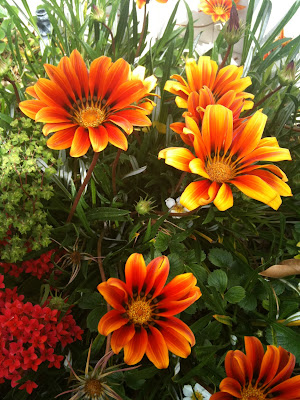
iPhone Flowers

I was sifting through my iphone pictures and collected some of my favorite photos of flowers I've taken over the last few years. There is so much beauty in nature :)


Sunday, October 28, 2012

Orange and Beignets

Today is going be a mix of little bits of creativity. We'll start with clothing.

 I recently bought a green and black patterned shirt at Cotton On for $10. It has a a silk appearance with a bit of shimmer giving it a polished look. Not only was it affordable and elegant but most importantly it was Comfortable!  I'm usually hesitant about buying looser clothing afraid it will swallow up my short frame but I couldn't pass it up and figured it might work with some skinny jeans or leggings. So here is the outfit I put together for this shirt.


 Here is a close up of the shirt so you can see the pattern and also a side view since it changes lengths.


 Here is the evolution of the look.
1) I chose white pants because the shirt is already dark. Also it was a sunny day today so white pants fit the mood of the weather.
2)Since it's long and baggy, I wore heels to give me some height :)
3)Next I added a bracelet and necklace. I chose a necklace with a hint of bright colors to lighten up the look. The contrast in color makes the necklace stand out. The bright colors add another dimension to the look. I also chose a v-shaped necklace because it make the shirt looks less wide. Visually speaking, lines direct our eyes. The V of the necklace directs our eyes downward which visually cuts and narrow the width of the shirt. This is why horizontal stripes usually make us look wider. They direct our eyes outwards horizontally.
4) I added a orange bag to add some color and brightness. A little POP action with color.


Today I made some French doughnuts calls beignets. A friend gave me this mix as a gift and it expires November 1 so this was my last chance to use it before it was too late. Once the work week starts I know I won't have time to be deep frying these guys. My friend told me that you can actually get them in downtown Disney. I'll have to go try it sometime. I had some stumbles along the way but in the end my friend and I figured it out. It's all about the process and adventure. :P


 Lastly, here are some orange flowers I arranged. Something simple but I love flowers so I wanted to share them.


Tuesday, October 23, 2012

Cupcake Card

It was a friend's birthday this week so I decided to make a simple birthday card with the materials I had at home. I used stickers, tissue paper, felt, pillow polyester filling, and a cupcake liner. The fun thing about the card is how it sticks out from the surface and looks like a fluffy cupcake. I stuffed filling under the layer of pink felt so that it would fill the shape of the cupcake liner.  I tried to capture the perspective in the second picture. Then I used some word stickers and used that for the inside of the card. The words happened to be really fitting so I didn't have to think too hard to make them work and was still able to communicate my genuine thoughts and feelings.


Monday, October 8, 2012

Start of the Mourning Doves

I have been wanting to make a wall piece to fill the empty space above my bed and I've finally started! Other than my dandelion piece that I made awhile ago this is one of the first big projects I've done on my own that has not been a class assignment. 

I've had a vague feeling for a long time now of what I want to make but haven't really been able to envision it. I've spent this week trying to articulate my feelings into colors, shapes, forms, textures. I drew a few simple sketches of designs.In the end though, there was only so much I could do without actually playing around with some potential materials I had bought. Here are the sketches: they're VERY simple :)


I wrote down my thoughts, feelings, images that I had in my mind that I wanted to capture. This is what I started with:
PASSION. Dark red. Life. Nature. Graceful. Peaceful. Life-giving. Brown. White. Textured white acrylic paint. A hint of metal- something man-made. Contrast of natural and mechanical. Delicate. Soft. More white. Flowers. Movement. Growth. Energy. Nurturing. Uplifting. Details.

I am someone who likes to plan ahead. It makes me nervous just venturing into the unknown, uncertain of where exactly I'm headed. But I learned from my art classes that art is going to require some uncertainty and spontaneity- some going with the flow, riding the wave. I looked at this white canvas. Focused my internal eyes on the words I had written above. Took a deep breath and dove in. Here are some photos of what I ended up with today and some of the process of getting there.

I glued together sticks I had collected into a shape that captured the feeling of gracefulness, energy, movement, growth. 


Next, I used wire, a textured paper, and Mod-Podge to make a flower.

As I was arranging the branches, I had a defining moment. I realized that I wanted to put birds in this piece. It felt fitting and slowly I started to get a concept in my head of what I want to do with this artwork. I had wanted to somehow incorporate wire in it, so I decided to attempt to make a wire bird. I had never done this before and it was actually really scary starting it. I watched a youtube video to get an idea of how to start.
I researched mourning doves on google images and observed its basic shape. I printed out some photos of birds in the actual size I wanted to make the wire bird...about 4-5 inches and then I just went for it!


 The other challenging part other than just making the bird is that I only needed half a bird because it's going to protrude from the canvas. I needed to add a tail though because when people see it from the front view, the bird will need to look like it has a tail.

 And so...this was the product for the day! I spent maybe4 hours on it today. I still have quite a ways to go but I think the hardest part is done- starting it and having a vision. :)


Thanks for reading!

-M